Unified Card System
Redesigned PayPal's mobile card management — simplifying navigation, surfacing key actions, and reducing cognitive load for 100M+ users.
A 7-phase process spanning user research, synthesis, and iterative design — collaborating across Research, Content Design, and Engineering to ship a unified card experience on iOS.
- User interviews & surveys
- Card sorting sessions
- Competitive audit
- Affinity mapping
- Persona development
- Journey map creation
- "How might we" framing
- Concept sketches
- Prioritization matrix
- Site map restructure
- User flow diagrams
- Card sort validation
- Wireframes & layout
- Hi-fi mockups (iOS)
- Interactive prototypes
- Moderated usability tests
- A/B task comparison
- Iteration cycles
- Dev handoff & specs
- QA review
- Launch & monitoring
Why this mattered
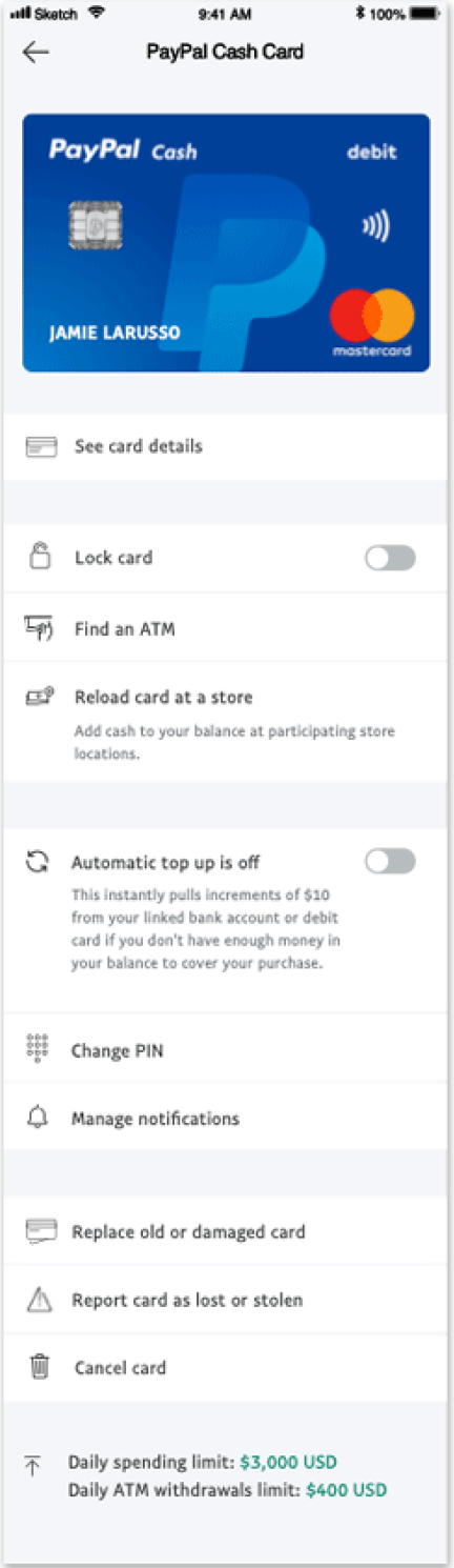
PayPal's card experiences had grown organically — consumer vs. business cards, virtual vs. physical, web vs. mobile all exposed card information differently. Customers routinely asked "Where do I copy the card number?" or "What actually happens if I lock my card?" Internally, teams were shipping product-specific flows that didn't scale.
I led IA, flows, and high-fidelity design on iOS in partnership with Research and Content Design. Constraints included design-system alignment, legal copy for card states, and reusing existing backend capabilities — no net-new APIs. Success meant: customers locate key actions instantly, clearer mental model of card states, and a reusable pattern across new card products.
What we learned from users
We combined card sorting, unmoderated task baselines, and in-lab studies. The patterns were consistent: people couldn't tell cards apart at a glance — especially with multiple cards on the account. "Copy number" lived in different places depending on the card, so muscle memory failed. The lock flow felt risky because it wasn't clear what locking actually changed.
Two archetypes captured the spectrum: Linda (juggles personal + business, wants clean separation) and Mike (pays quickly and safely, wants "Copy number" to be one obvious action).
Core pain points
"I can never find where to copy my card number — it's in different places every time."
Inconsistent placement breaks user muscle memory"All my cards look the same. I can't tell business from personal."
Poor visual hierarchy causes selection errorsLock flow creates anxiety — users don't understand what actually changes or for how long.
Research synthesis across 12 participant sessionsUser personas


- Linda: Juggles personal and business accounts — needs clear card separation at a glance.
- Mike: Values quick, secure checkout — needs "Copy number" to be one obvious action.
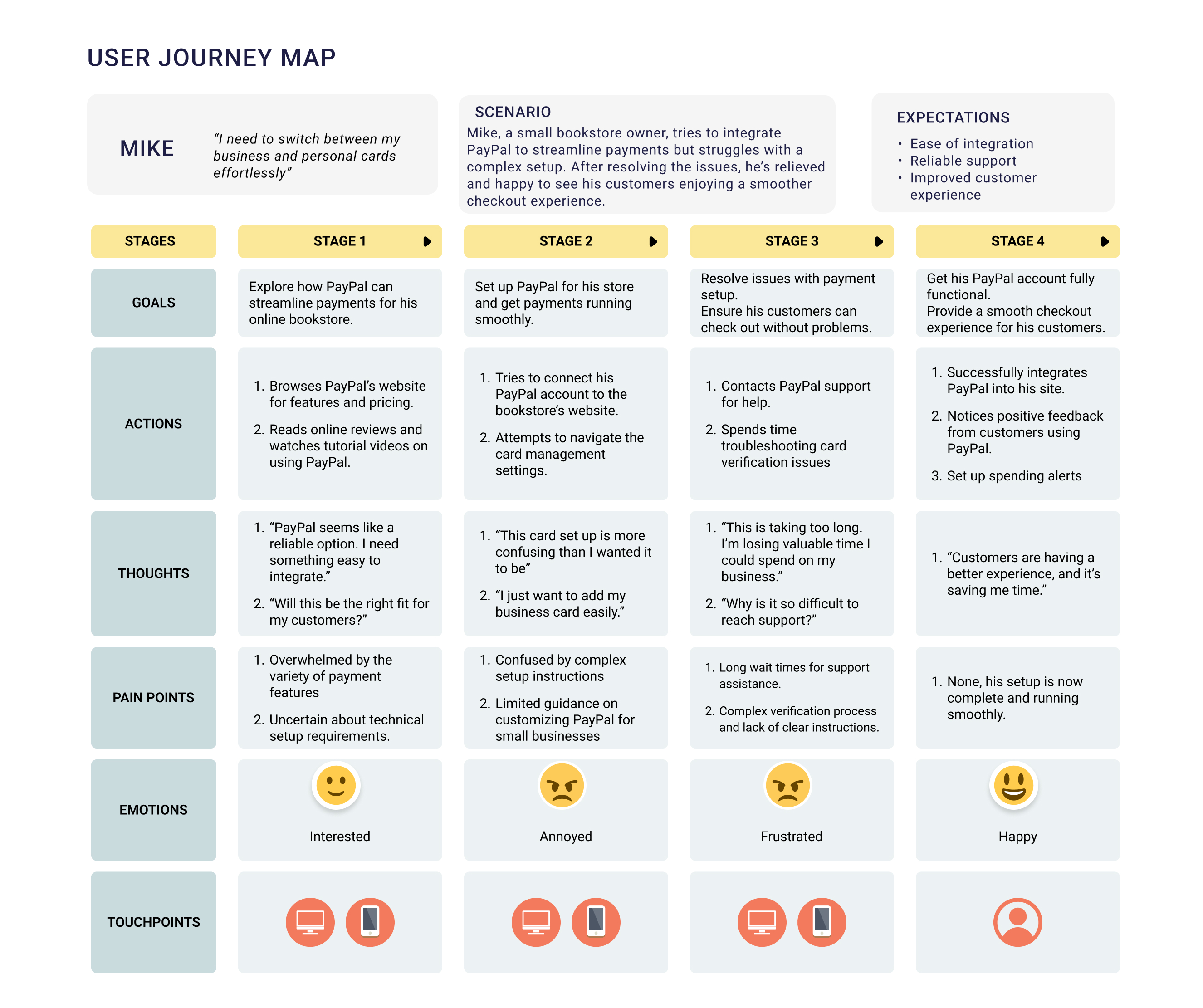
User journey maps
We translated interview insights into journey maps for Linda and Mike — visualizing goals, actions, thoughts, and pain points across each stage. This pinpointed where confusion peaked and surfaced shared pain points across user types.
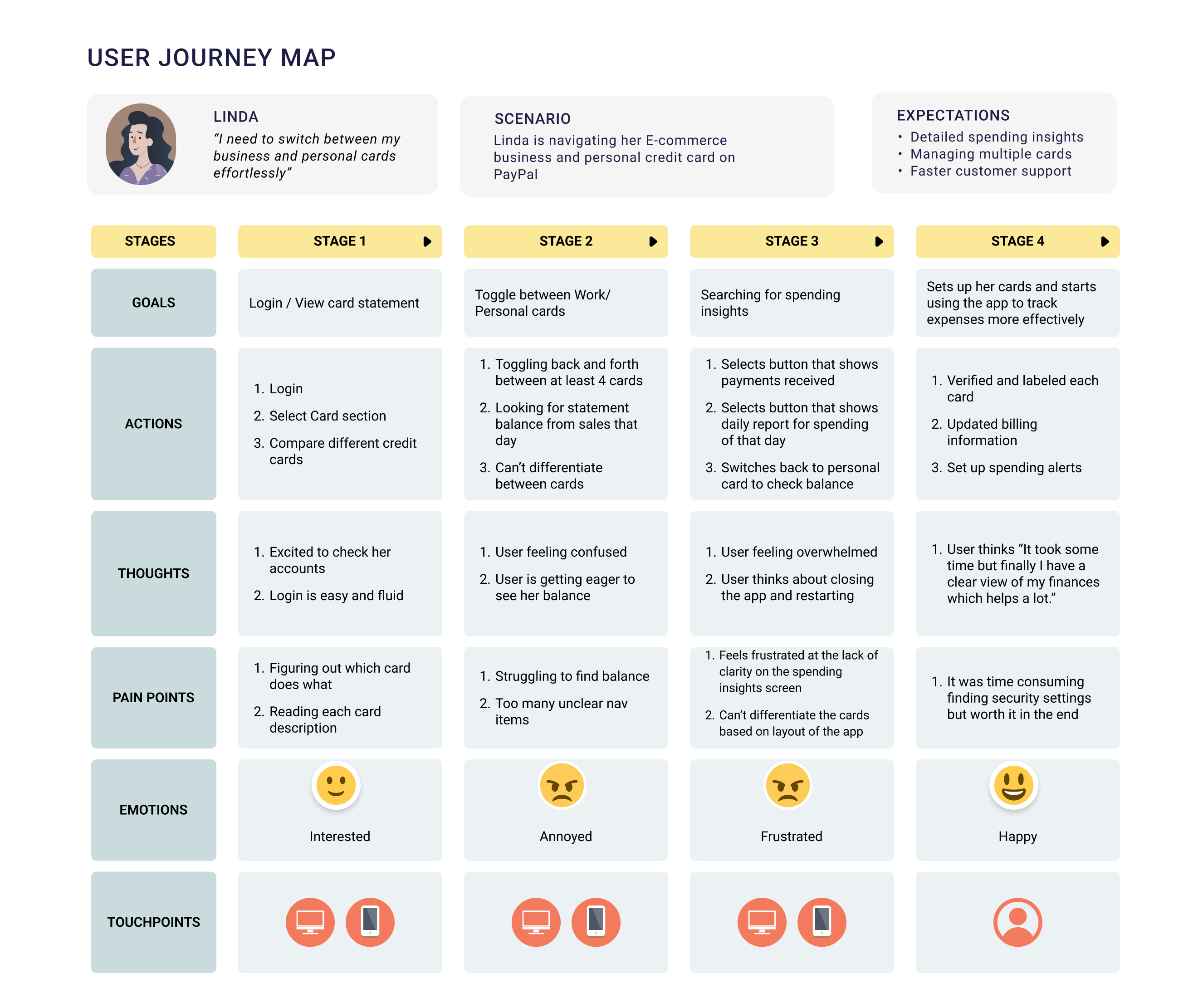
- Linda's map: friction toggling between cards, confusion peaking in Stages 2–3.
- Mike's map: anxiety in the fast pay flow and uncertainty managing multiple cards.
- Card recognition broke down early, forcing users to re-read labels repeatedly.
- Copy number placement was inconsistent, lowering discoverability.
- Lock state felt risky and unclear without duration or outcome language.
Ideation
Using research insights, I focused brainstorming around two axes: usability (reducing friction, clarifying actions) and security (building confidence in sensitive states). These early concepts defined where to simplify while staying true to user needs.

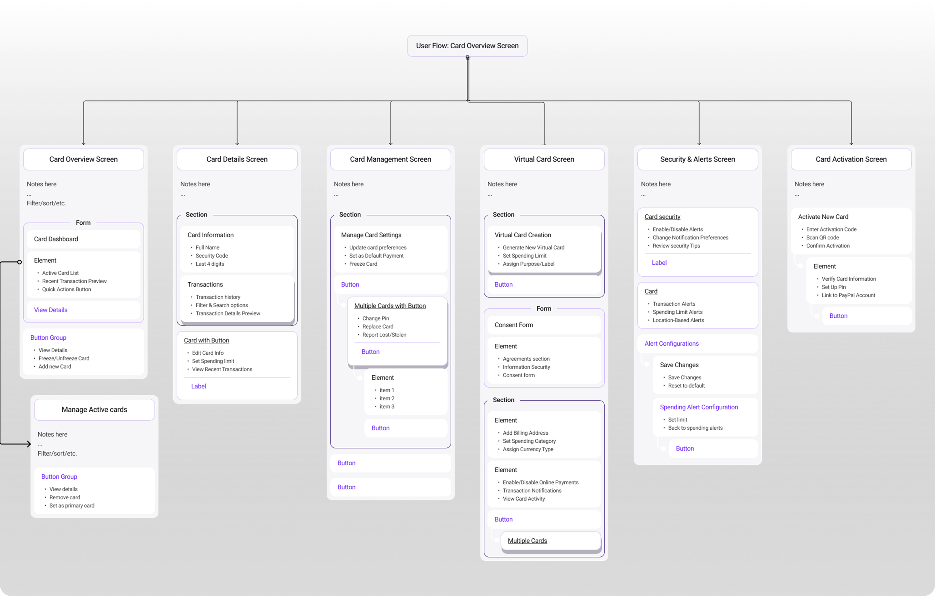
Information architecture
I collaborated with researchers to map out IA and user flows, focusing on card activation, virtual card creation, security states, and card settings. By structuring these into intuitive groups, we gave customers a predictable, reusable model that reduced cognitive load. We validated through lightweight wireframes and card-sorting sessions before moving into high-fidelity design.
From research to action
Synthesizing Linda and Mike's journeys highlighted two critical needs: clarity of actions and confidence in sensitive states. We translated these directly into design principles that guided every iteration.
- One obvious "Copy number" action across all cards.
- Visual tags to distinguish business vs. personal cards.
- Plain, human language around lock/unlock to reduce anxiety.
Early explorations
This was our baseline starting point — the existing PayPal card experience. While functional, users struggled to find key actions, with critical features buried behind generic labels and scattered across multiple screens.

- Too many entry points confused users about where to start.
- Critical actions hidden behind vague "Settings" label.
First iteration
I hypothesized that users would be comfortable with a nested flow for card details while surfacing other settings on the main page. Typography and layout were adjusted for clearer grouping. Lock Card was prioritized as a high-use feature, and the copy card number interaction was redesigned for clarity.
What we learned
- Lock Card: Users responded well, but placement didn't fit logically with its group.
- Copy Number: Clearer and more usable, though nested details created confusion.
- Spending Limits: Still difficult to locate and understand.
- Visual Design: Green color wasn't scalable globally; icon placement caused tapping issues.
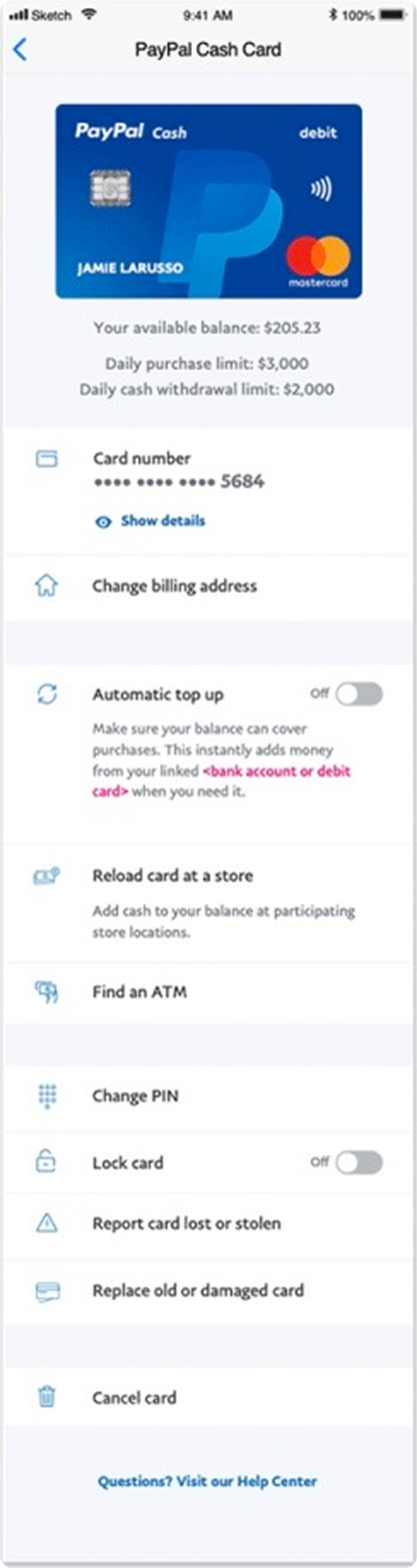
Arriving at the solution
I surfaced as much information as possible, grouping features appropriately while refining typography and icons for scannability. Card details used an accordion pattern — secondary information hidden but easily accessible.
Balances and limits were aligned with the card on the landing page, giving users visibility without overwhelming the flow.
What changed
- Reduced decision points: fewer entry paths, one obvious primary action.
- Grouped by intent: Security, Money movement, Management — scan once, act fast.
- Hierarchy clean-up: typography + icon pass clarified primary vs. supportive actions.
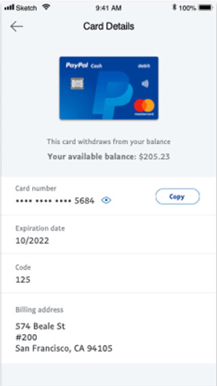
Feature deep-dive: Copy card number
- Problem: "See card details" was buried; many users typed numbers manually at merchants without PayPal checkout.
- Approach: Make Copy the obvious primary action; keep full details hidden until the user opts in (accessibility + security).
- Outcome: +30% discoverability, –20% time-to-copy.

Feature deep-dive: Lock card
This feature emerged from market analysis and customer feedback. Users often canceled misplaced cards only to reactivate them later — causing frustration and unnecessary costs for PayPal.
A switch was ideal for the on/off function. I collaborated with the content designer to refine messaging based on research — communicating clearly what users could and couldn't do in a locked state, with messages appearing only when most relevant.
I also designed a new icon for lock card states following PayPal's UI guidelines while visually reinforcing the feature's status.
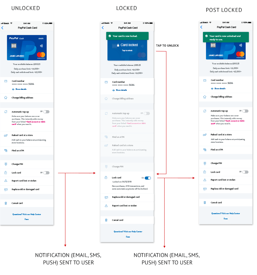
- Unlocked: default state with all actions available.
- Locked: clear status change with explanation of what's restricted.
- Post-locked: reassurance on next steps and how to unlock.
Results & impact
We shipped the Unified Card System on iOS in February 2020. User tests and live usage showed a cleaner mental model, faster task completion, and higher confidence with sensitive states.
- Scalable foundation: standardized patterns across consumer & business cards and new markets.
- Feature velocity: unlocked follow-on features and a prioritized card product launch in Q4 2020.
- Fewer cancellations: lock/unlock gave people a safe "pause" instead of replacing cards.
Let's build something together.
I partner with teams who believe design and AI can create extraordinary experiences.