A 5-phase Design Thinking process — user interviews, journey mapping, iterative wireframing, high-fidelity prototyping, and rigorous usability testing with 25 participants.
- Business analysis
- Research review
- Competitive analysis
- User interviews
- Empathy mapping
- Journey mapping
- User flows & IA
- Lo-fi wireframes
- Preference testing
- Hi-fi designs
- A/B test variants
- ADA compliance
- Moderated usability
- Icon recognition
- Dev handoff
The challenge
With the advent of COVID-19 and a surge in demand for mobile healthcare, Kaiser Permanente's app needed to evolve. Users were struggling with unclear navigation, fragmented workflows, and confusing widgets — particularly around scheduling, prescriptions, and physician messaging.
Problem
Multiple usability barriers across the app's core workflows were driving up support calls and reducing user confidence in digital healthcare tools.
My role & team
- I led a team of 7 designers.
- I worked directly with two UX researchers who specialized in user research for Kaiser's patient-facing products. They conducted the interviews — I sat in on the majority of sessions and co-led synthesis with them.
- Other designers on the team collaborated with me across sprints, gathering data from interviews and usability tests.
- I was the primary liaison to product management — I brought research findings and design direction to my PM in regular sprint syncs.
- I collaborated with engineering leads on feasibility before committing to design direction.
The top 3 reasons patients use the Kaiser app: scheduling appointments, ordering prescriptions, and messaging physicians.
Users reported friction due to unclear navigation, appointment availability, and messaging delays. Multi-step flows created confusion, especially for older patients.
Discovery & research
I partnered with two UX researchers who specialized in Kaiser's patient-facing products to plan and conduct our research. Together we designed an interview guide focused on the three tasks patients used the app for most — scheduling appointments, ordering prescriptions, and messaging their doctors. The researchers led 25 interviews over video calls across a mix of age groups, tech comfort levels, and healthcare needs. I sat in on the majority of sessions so I could hear the friction firsthand — not just read a report after the fact.
Key insights
- Remote care is becoming an expectation — users need strong usability, personalization, and simplicity in mobile healthcare.
- Communication is the primary use case — messaging doctors and scheduling appointments are the top reasons patients open the app.
- Feature overload causes confusion — several widgets and features were not understood by users and cluttered the experience.
Define
Leveraging Kaiser's existing user personas along with data from high-level interviews, we created journey maps to identify critical touchpoints and opportunities to enhance the overall experience.
Journey mapping

User flows
Mapped the core task flows — appointment scheduling, prescription refills, and physician messaging — to identify where users were dropping off and where steps could be consolidated.

Ideation
Drawing from user interviews, surveys, and competitive analysis, I collaborated with the team to brainstorm key features and elements. We began with lo-fi wireframes to outline structure, layout, and components — allowing us to quickly test and iterate before moving into detailed design.
Lo-fidelity wireframes

Hi-fidelity wireframes
After several rounds of revision based on preference testing and stakeholder reviews, we added Important Alerts and Upcoming Visits to personalize the experience. We optimized the messaging section by adding physician portraits and refined designs into hi-fi wireframes.
This came directly from research synthesis. Users were opening the app with a specific task in mind but landing on a generic home screen that didn't surface what was relevant to them. I worked with our UX research team to identify the highest-priority personalization signals and proposed surfacing alerts and upcoming visits above the fold. I presented this to my PM with supporting interview data and we prioritized it for the next sprint.

Prototyping
Building on strong foundations from Define and Ideation, we developed high-fidelity interactive prototypes. These designs were prepared for A/B testing against the existing experience and refined through collaboration with ADA and design system teams to ensure full compliance.

I presented three layout directions during sprint review; we aligned on the path that tested strongest with users and that engineering could ship within our timeline — after walking through tradeoffs with my PM and eng lead. View the interactive prototype →
Usability testing
We ran moderated usability tests to validate our design decisions. Two critical findings shaped the final direction.
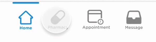
Finding 1: Icon recognition failure
The stethoscope icon representing "Appointments" didn't translate for 60% of users. We revised it to a calendar — follow-up tests showed a 35% increase in recognition, significantly improving thumb-nav usability.
This surfaced during moderated usability testing that I co-led with our UX research team. After 60% of users failed to recognize the stethoscope, I explored alternatives and brought three icon options back to the team. We tested all three in a follow-up round — calendar won because it matched users' existing mental model. I presented the data to my PM and engineering lead and we aligned on the change in the same sprint.

Finding 2: Decluttering the message page
Users found the Billing and Medical Records tabs on the message page unnecessary and confusing. Relocating them to the homepage menu reduced clutter and created a cleaner messaging experience — confirmed in follow-up interviews.
During interview synthesis sessions with the research team, we kept hearing the same thing — users went to Messages with one intent: talk to their doctor. I flagged this pattern during our weekly design review and proposed relocating Billing and Medical Records to the homepage menu. There was initial pushback from stakeholders worried about discoverability, but usability data supported the move. Follow-up interviews confirmed users preferred the cleaner experience.


Results & impact
By following UI/UX best practices and centering every decision on user needs, this iteration of the mobile app shipped to users and delivered measurable improvements.
- Foundation for migration: the process and testing framework established here laid the groundwork for Kaiser's immense migration to MyChart.
- Improved navigation clarity: icon and label changes reduced confusion and aligned with user mental models.
- Cleaner experience: decluttering key screens improved task focus and user satisfaction.
Looking back, I would have pushed harder for stronger quantitative baselines at kickoff so we could tie every change to a sharper before-and-after story. This project also reinforced for me that in regulated, high-stakes products, the highest-leverage design work often shows up in structure and clarity before pixels.