A six-phase process designed around the unique constraints of AI onboarding, where trust, safety, and speed-to-value all compete for attention in the first 60 seconds.
- Drop-off risk mapping
- Hesitation points
- Competitive scan
- AI-extracted requirements
- Risk & constraint mapping
- PRD highlights
- Happy path flows
- Safety guardrails
- Recovery paths
- Welcome screen
- Interest selection
- First prompt UX
- PM/Eng alignment
- Copy & safety review
- Scope finalization
- TTFP tracking
- Completion rates
- Drop-off analytics
The landscape
When Claude launched publicly in March 2023, there were no established patterns for AI onboarding. Competitors dropped users into an empty chat box and hoped for the best. The result: high bounce rates, low first-session activation, and users who never came back.
Competitive audit
I audited onboarding flows across the major AI assistants to map gaps and opportunities. The pattern was clear: nobody was designing for trust.
- Empty text box, no guidance
- Suggestions generic ("Tell me a joke")
- No trust messaging at point of entry
- High blank-page anxiety
- Carousel of example prompts
- Google-branded but impersonal
- Safety disclaimers in footer (buried)
- No personalization in first session
- Trust-first welcome with brand warmth
- Personalized interest selection
- Contextual safety at moment of relevance
- Guided first prompt, not prescriptive
The challenge
Claude's onboarding needed to solve three problems simultaneously: earn trust around AI privacy and safety, get users to their first valuable interaction in under 60 seconds, and minimize per-step drop-off, all in a category with no established patterns.
Trust Before Value
Users wouldn't type a single prompt until they believed their data was safe. Trust had to precede utility, not follow it.
No Precedent
No proven patterns for AI onboarding existed. Every decision required first-principles thinking about a new product category.
Compressed Timeline
Onboarding had to ship alongside product launch. The window for research, design, and validation was measured in weeks, not months.
What users told us
Early user interviews and beta feedback surfaced three recurring themes that shaped every design decision in the onboarding flow.
"I opened it and just stared at the box. I didn't know what to type. What if I asked something stupid?"
"I tried ChatGPT but it felt like talking to a search engine. I want something that actually understands context."
"My first question is always: is my data being stored? Is someone reading my prompts? Until I know that, I hold back."
"The moment it gave me a genuinely helpful answer, that's when I decided to keep using it. Everything before that was noise."
Key themes → Design decisions
Artifacts & deliverables
Key artifacts that shaped every decision in the onboarding experience, from journey mapping to final shipped screens.
User journey map
Mapped the complete path to first successful prompt, identifying drop-off risks, trust moments, and success checkpoints at each step.
- Hears about Claude from a colleague or article
- Visits claude.ai, reads landing page
- Compares to ChatGPT and Gemini
- Clicks "Get Started"
- Creates account with email
- Verifies email address
- Sees warm welcome screen
- Reads "helpful, harmless, honest" positioning
- Notices privacy reassurance copy
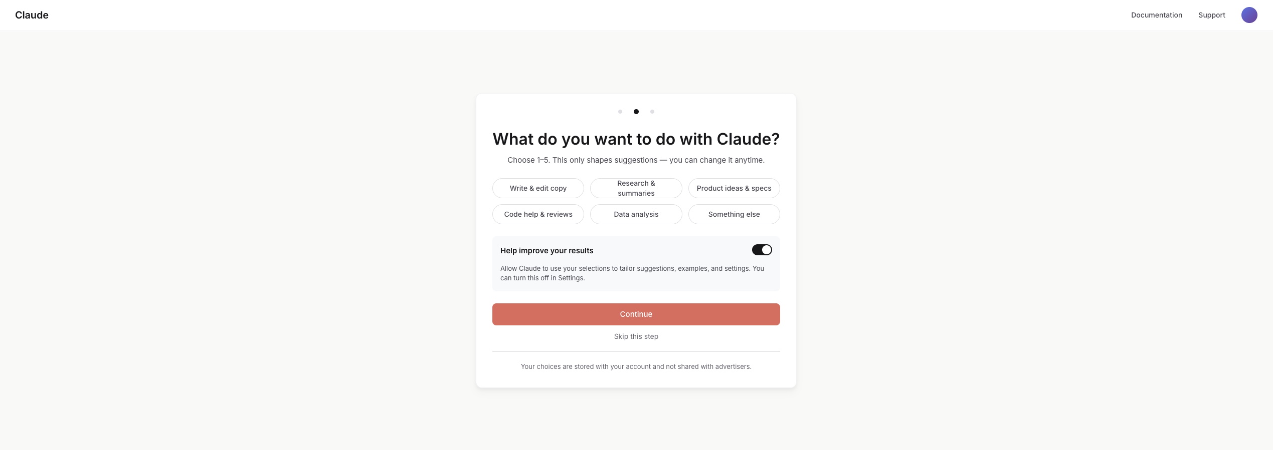
- Selects interest areas (writing, code, research)
- Sees Claude adapt to selections
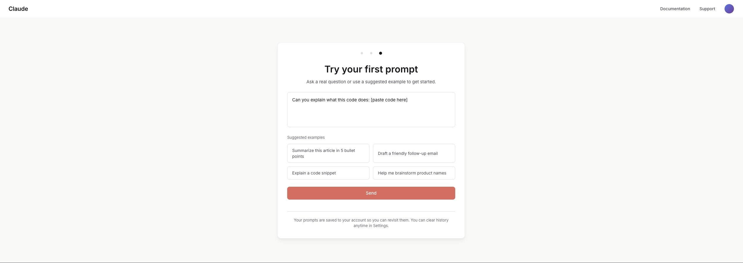
- Chooses a starter prompt or types their own
- Receives first response from Claude
- Decides whether to continue or leave
Feelings
Curve
Opportunities
Trust & safety playbook
Unified messaging principles and objection-handling into a single source of truth, ensuring consistent, calm tone across every touchpoint.

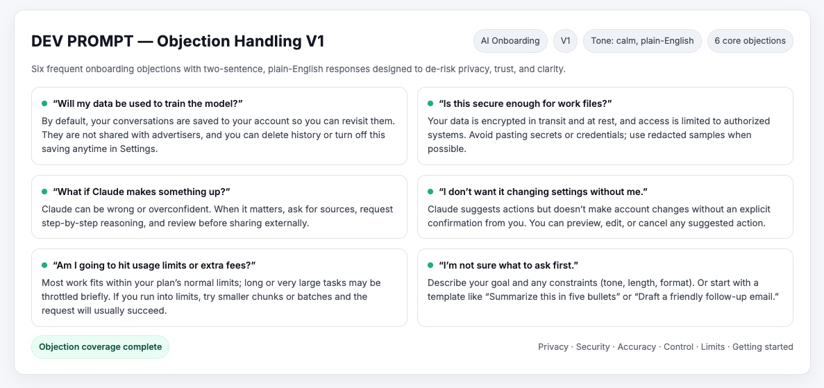
- Calm, transparent tone: no anthropomorphizing Claude
- Contextual reassurance replaces disruptive modal walls
- Guardrails turn rejection into guidance: "I can't help with that, but here's a safer approach"
Information architecture
The onboarding IA condensed a five-step flow into three screens. Every node maps to a design decision: what earns trust, what creates friction, and where users recover if something goes wrong.
Design iteration: welcome screen
The welcome screen went through three major iterations. Each round was informed by internal feedback and the research themes above.
Final onboarding screens
Three steps, one cohesive experience: Welcome → Interests → First Prompt. Trust messaging embedded contextually; starter prompts guide without limiting creative freedom.

Final shipped welcome
The moment users reached after onboarding. Simple, trust-first, ready for interaction. The culmination of every design decision.
Success metrics schema
Every design choice tied to a measurable outcome: TTFP ≤ 60s, drop-off ≤ 10%, first-session success ≥ 85%, activation ≥ 75%.

Design decisions & tradeoffs
Where speed met judgment. Designing for clarity, trust, and flow under tight timelines.
Guided vs. free prompting
Before First-time users faced an empty text box and didn't know what to ask. Beta feedback confirmed: "I opened it and just stared." Many froze or dropped off before their first message.
Decision Introduced three optional "starter prompts": safe, engaging entry points without limiting creative freedom. Users could still type anything.
Result First-session activation jumped as users felt supported, not overwhelmed.
Alternatives considered: A tutorial walkthrough (too heavy, users skip), auto-generated prompt suggestions via AI (unpredictable at scale), and a "what can Claude do?" explainer page (added friction before value). Starter prompts won because they reduced anxiety without adding steps.
Trust placement
Before Onboarding began with a long modal explaining safety and data handling. It earned trust but killed momentum. Most users dismissed it without reading or dropped off entirely.
Decision Broke trust messaging into contextual microcopy placed at the moment of relevance. "Claude never stores personal data" appears directly under the first input field, not in a separate screen.
Result Users stayed engaged and absorbed the message naturally. Safety became ambient, not an interruption.
Alternatives considered: A dedicated "Privacy Promise" screen (tested, users skipped or bounced), a footer disclaimer (invisible, no trust impact), and a persistent sidebar (too intrusive for the conversational UI). Inline microcopy hit the sweet spot: visible when it mattered, invisible when it didn't.
Condensing steps
Before The flow stretched across five screens: Welcome, Safety, Interests, Permissions, and First Prompt. Slow, procedural, and felt like a government form.
Decision Merged Interests + Safety into one step and simplified permissions, trimming from five to three total screens. Each screen now served exactly one purpose.
Result Time-to-first-prompt dropped by 40%. The flow felt lighter, faster, and more conversational.
Alternatives considered: A single-page scroll (no clear progress signal), a progressive onboarding that revealed steps over days (too slow for activation), and a "skip all" option (defeated the purpose of trust-building). Three steps was the minimum viable trust path.
Edge cases & guardrails
These weren't edge cases. They were design requirements. Each one reinforced user trust through clear, ethical behavior.
Privacy
Clear disclosure before first prompt about what data is and isn't stored, shown in context, not buried in terms.
Misuse Prevention
Guardrail copy for unsafe prompts, turning rejection into guidance: "I can't help with that, but here's a safer approach."
Accuracy & Transparency
Inline "confidence framing" to set expectations around AI limits, reducing hallucination-based trust issues.
Drop-off Recovery
Resume onboarding where users left off (no restart) to protect momentum and reduce frustration.
Cross-functional collaboration
Onboarding touched Product, Engineering, Trust & Safety, and Content. Here's how I kept alignment tight under compressed timelines.
Product Management
Shared the journey map and competitive audit early to align on scope. Used the success criteria as a shared contract. PM and I defined targets together at kickoff, not after launch.
Engineering
Wireframes included acceptance criteria per screen. Decision cards documented the "why" behind every choice, reducing back-and-forth during implementation.
Trust & Safety
Brought Trust & Safety into the messaging principles review before any screens were built. Their input shaped the contextual reassurance pattern rather than being bolted on later.
Results & impact
Success criteria defined at project kickoff. All targets met or exceeded at launch.
"The onboarding tone aligned with our brand values on the first review. That almost never happens." (Trust & Safety team feedback)
Beyond the quantitative targets, the qualitative signal was equally strong: internal stakeholders noted the onboarding felt "distinctly Claude" (warm, honest, and unhurried) rather than a generic product setup flow. The trust messaging approach became a reusable pattern adopted by other product surfaces.
Closing reflections
This project taught me that trust is itself a design material, as tangible as color or spacing. Every decision either earned trust or eroded it, and there was no neutral ground.
Trust is the Product
In non-deterministic systems, you can't control output, only the frame around it. Every design choice was really a trust choice: how much to promise, when to reassure, what to leave unsaid.
Where Craft Mattered
Hierarchy, spacing, tone, and judgment turned drafts into shippable screens. Warm beige instead of white. Serif type for Claude's voice. Craft is what made trust feel effortless.
Speed vs. Depth
Compressed timelines forced sharp prioritization. I learned to distinguish between "good enough to ship" and "good enough to learn from," and to ship both.
What I'd do differently
Longitudinal trust research
We optimized for first-session trust, but I'd invest more in understanding how trust evolves over weeks. Does contextual reassurance lose impact after the 5th session? Does the user's mental model of Claude change? A diary study would answer this.
More granular segmentation
We treated "first-time user" as one persona. In reality, a developer evaluating Claude for code review has radically different trust needs than a writer exploring creative use cases. I'd segment the onboarding path earlier and personalize more aggressively.